How to Strip the 'AI Look' From Your Marketing Materials
To make AI posters look professional, stop using generic adjectives. Request specific design movements like Bauhaus or Swiss Style to force clean grids, limited colors, and bold typography.
Key Takeaways
- Identify specific design schools like Bauhaus or Risograph to give the AI a ruleset.
- Ban 'pastel' and 'airbrush' styles in your prompts to avoid the artificial look.
- Use high-contrast, limited color palettes to make digital art feel like physical print.
- Prioritize negative space through Swiss or Japanese Minimal styles to improve readability.
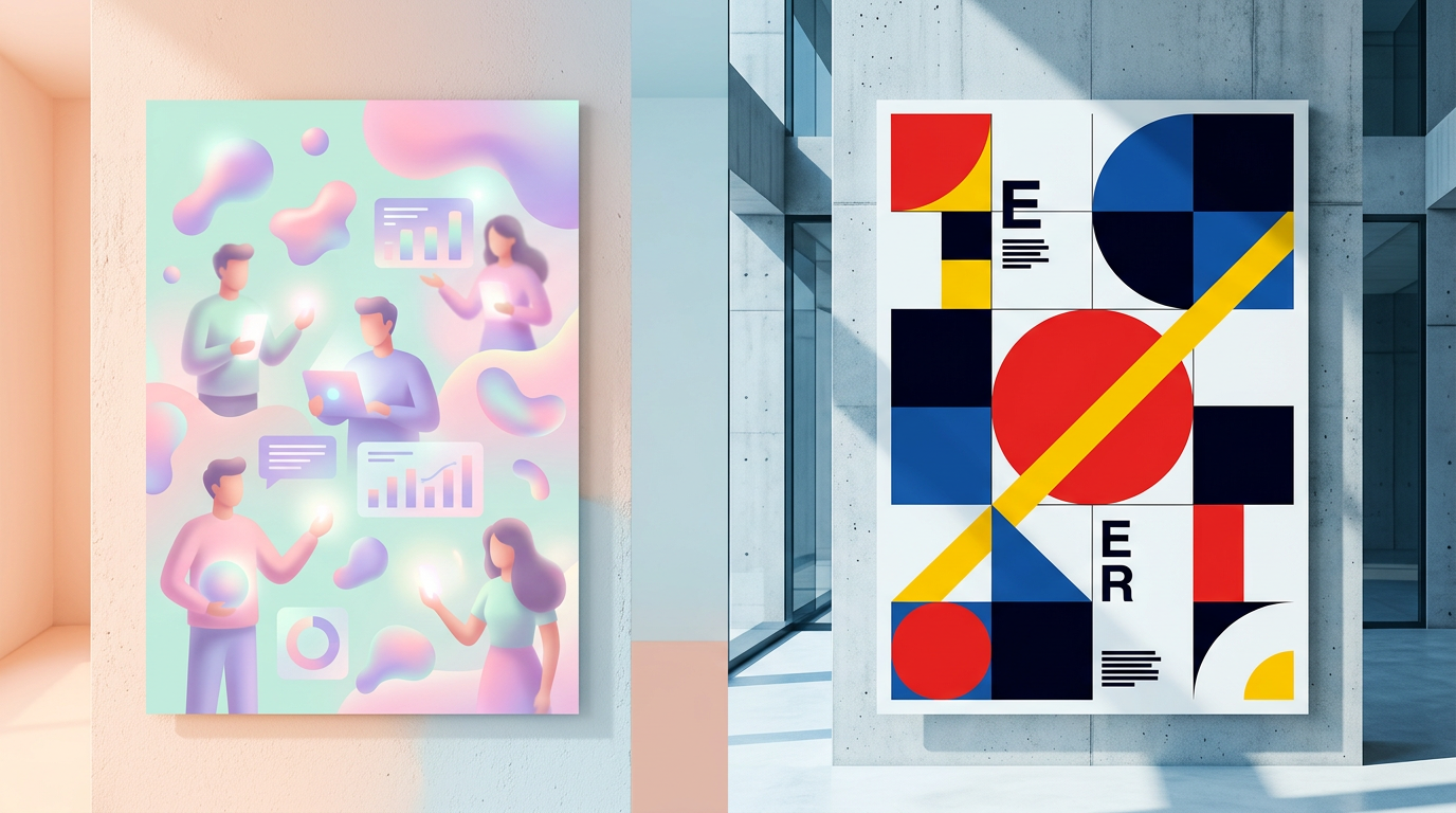
Most AI posters look cheap because they default to a generic, airbrushed style. When you ask for a spring fair flyer, the AI usually spits out a cluttered mess of pastel bunting and clip-art flowers. It looks like a computer trying to mimic a human, and your customers spot it instantly.
To get professional results, you've got to move past the default settings. Professional design relies on structure and restraint. You can fix the look by calling for specific design movements that force the AI to use a logical grid and a tight color palette.
1. Swap Adjectives for Design Movements
Instead of using vague words like pretty, name a specific design school. This acts as a ruleset for the AI. For example, asking for Bauhaus or Modernist styles forces the AI to use geometric shapes and asymmetrical layouts. These styles prioritize function, which cleans up the visual clutter found in basic prompts.
2. Bolt on a Strict Color Budget
Generic AI art uses too many gradients, making it look like a glossy 3D render. You can strip this back by requesting a Limited Palette or Flat Illustration. If you want a handmade feel, ask for a Risograph style. This mimics a printing process that uses limited ink colors and adds a grainy texture to hide artificial smoothness.
3. Use Negative Space
Beginners often try to fill every inch of the page. Professional designers use whitespace to lead the eye to the most important details. You can get this by requesting Swiss Style or Japanese Minimal. These frameworks use a strict grid and plenty of empty space so your event details don't get lost.
The Anti-Generic Prompt Workflow
When you need a marketing asset, don't just list the event details. Use this checklist to wire up a better prompt:
- Define the Anchor: Name one specific style like "Bauhaus" or "Swiss Style."
- Set the Ban List: Tell the AI to avoid "pastels, airbrushing, or oil painting styles."
- Pick One Graphic: Choose one bold element, like "a single geometric flower," instead of a whole field.
- Control the Type: Ask for "bold sans-serif typography" so the text stays readable.
If you want to see how to stack these styles to build a full campaign, join our next live session. We walk through the prompts that move your brand toward a high-end identity.